CREATING A PALETTE
Working on a digital canvas means one has access to a near unlimited range of color. Though this seems like it should be freeing, it’s the opposite. A blank sheet of paper can leave a writer paralyzed, searching for the perfect word. A blank canvas can leave an artist paralyzed, trying to find the “right” color.
But creativity thrives under constraint. This is why I use a palette. Using the same few colors in every piece creates a visual unity across pieces. Also, a limited selection of color can act like a metaphor by alluding to colors that aren’t even present. A master can convey the entire spectrum of color with only a handful of swatches. I am not a master, but I have been using the same palette of only 40-some colors for years now. And what I want to do in this first part of a two-part color tutorial is show you how to create your own palette for use.
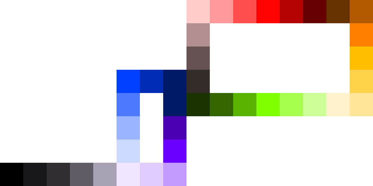
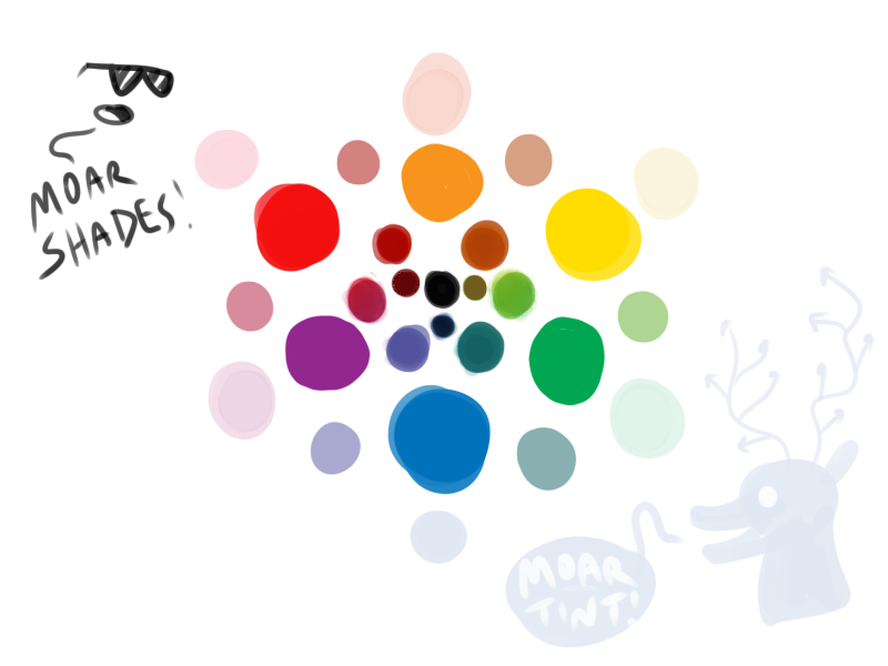
Above are the only colors I use in any single piece. The first iteration of this palette was created while working in sprite animation. Since then, I’ve made a few tweaks and adjustments to create the palette you see. Though useful in spriting, it may not be the most useful in digital painting. So let me show you how I made the palette to begin with, and then you can choose to link it up like this on your own if you like.
STEP 1 – CHOOSE YOUR PRIMARIES.
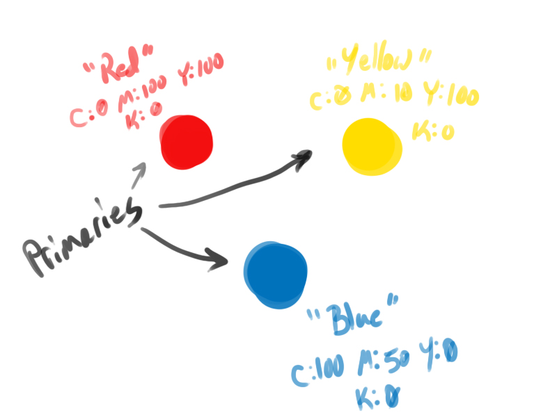
Growing up, many of us learned that the primary colors are red, yellow, and blue. Except when they are red, yellow, and green. Or cyan, magenta, yellow, and black. So really, it is up to you what colors you want to use as your primaries. For me, I’ll start with good ol’ RYB!
STEP 2 – CHOOSE YOUR SECONDARIES.
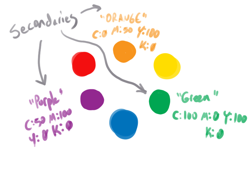
This step is a little clearer than the previous, as the secondary colors are the half-way point between each of the primaries. Of course, you can feel free to tweak your secondary colors as you see fit. Halfway between my red and blue was really brown instead of purple, so I adjusted some numbers until I got what I wanted.
STEP 3 – HEREEEEEEE COME THE TERTIARIES!
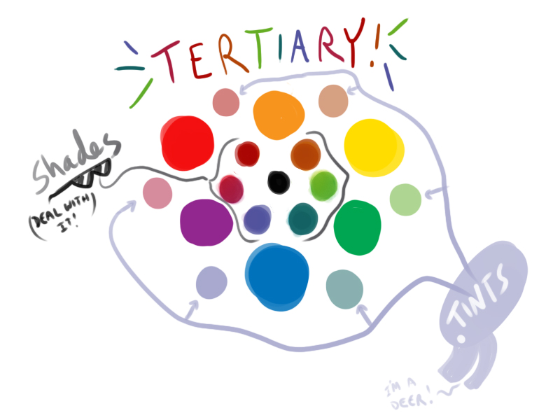
Tertiary colors are the ones between your primary and secondary colors. Of course, by this point, I want to start introducing shades and tints into the palette, so I’ve invited my friends, Shades McShady and Tintletoes the Grayish Deer!
STEP 4 – MORE?
Umm…guys….
STEP 5 – RUN.
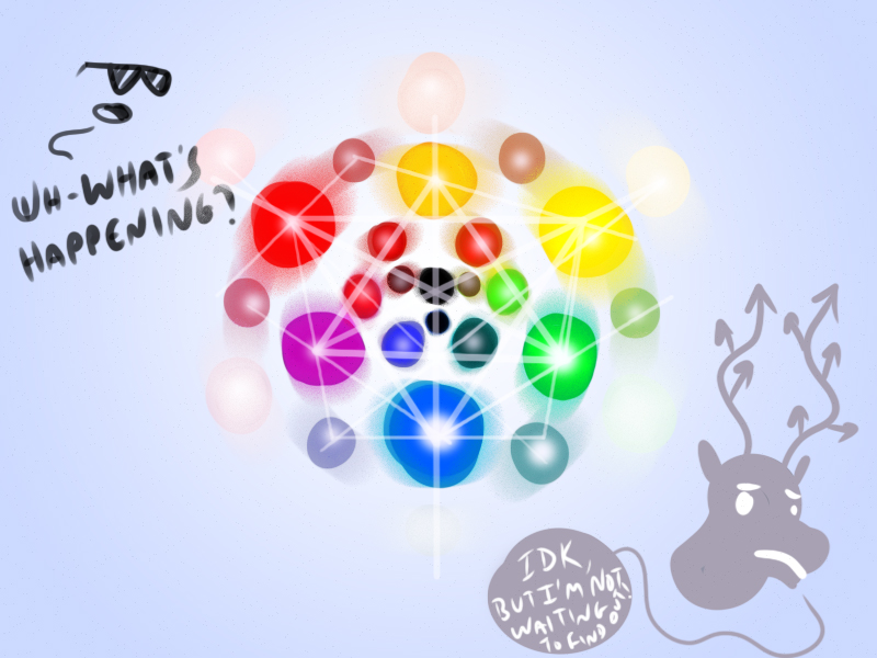
STEP 6 – UH OH. BETTER AVERT YOUR EYES.
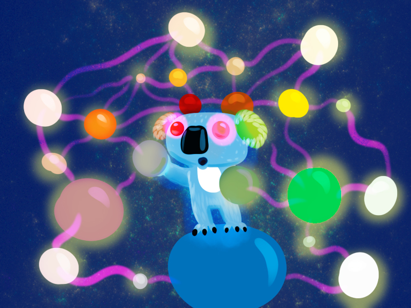
STEP 7 – [REDACTED]

STEP 8 – WHATEVER YOU DO, DON’T TELL HIM I WAS HERE.
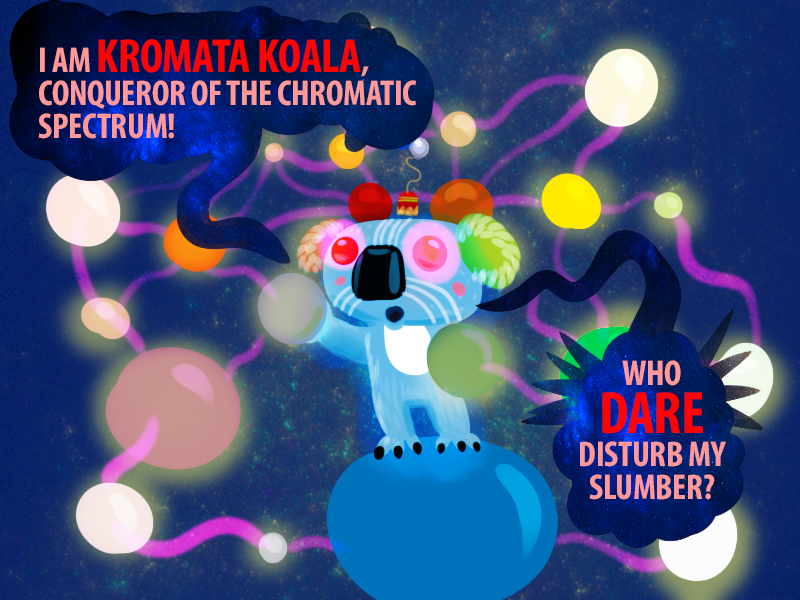
Ahh…who am I kidding. I’ll have to clean this up sooner than later. I’ll be back in a few hours. While you wait, why not try hiding under your desk and dreaming of gray skies. You know, for safety!